I’m a 🎨 UI/UX Designer with 2+ years of hands-on experience, blending creativity with research to craft intuitive, user-first digital experiences. My roots in graphic design, animation, and visual effects give me a unique visual edge in everything I design.
Innovative designs that elevate user experiences and engagement.
Hello,
Rahul here!
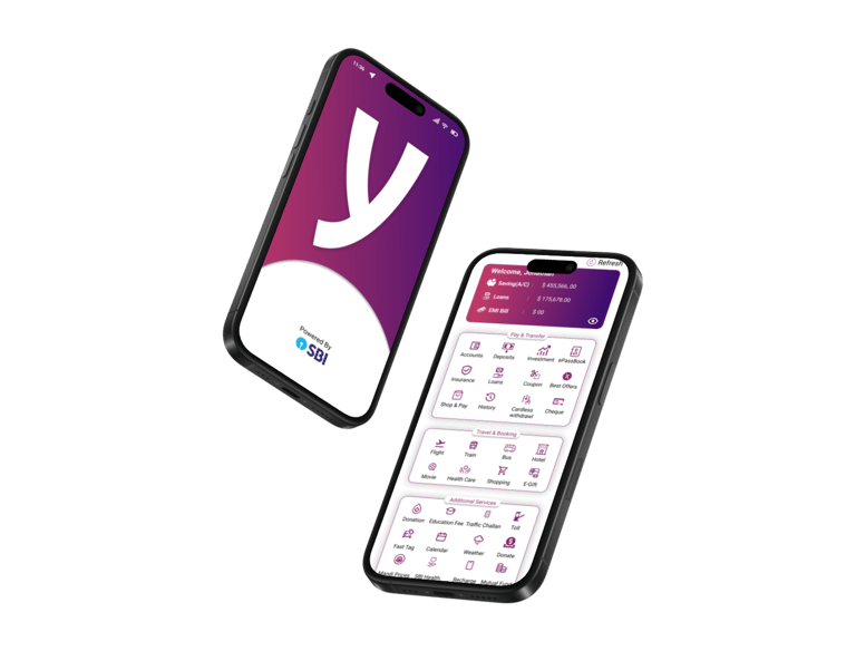
SBI YONO
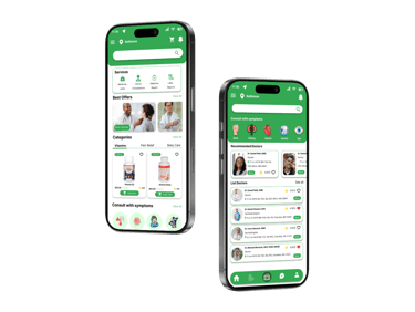
CareNext
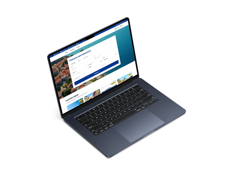
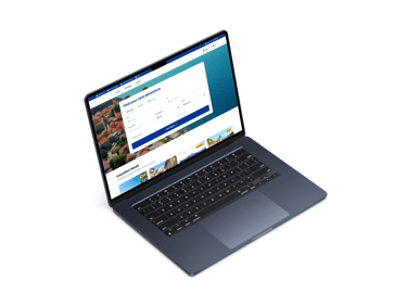
Ryanair


Projects
“SBI YONO is a one-stop digital platform for banking, shopping, and financial services.”
“CareNext is a healthcare project delivering smart and accessible patient-centered solutions.”
“Ryanair project is about creating a seamless, affordable, and user-friendly travel experience.”