Role
Timeline
Skills
Tools
UI/UX & Product Designer
December 16 - March 14
UX Research, Typography, Color Theory, UI Design
Figma, Photoshop, Miro, Fig jam
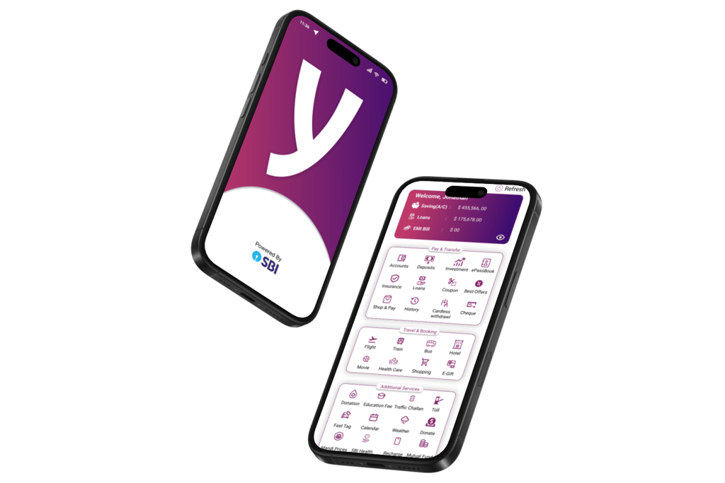
SBI YONO
Transforming Digital Banking for Everyone
PROJECT OVERVIEW
Why Are We Redesigning?
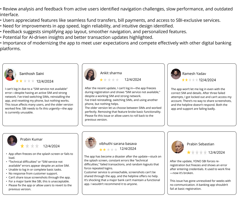
The original SBI YONO app, while widely used, presented major challenges for users—confusing navigation, inconsistent design, slow performance, login errors, and poor accessibility. These issues disrupted the user experience, lowered engagement, and reduced trust in the app. The redesign aims to address these pain points by creating a seamless, intuitive, and modern mobile banking experience that is fast, secure, and accessible for all users.
Problem Statement
What is SBI YONO?
SBI YONO (You Only Need One) is the State Bank of India’s flagship mobile app, offering banking, investment, shopping, and lifestyle services in one unified platform. It serves millions of users across India with the goal of making financial services simple and accessible.
Why this application?
Despite its popularity, user feedback revealed major issues—confusing navigation, slow performance, inconsistent design, and poor accessibility—causing frustration and reducing trust. A redesign was needed to modernize the experience, improve usability, and align with global digital banking standards.
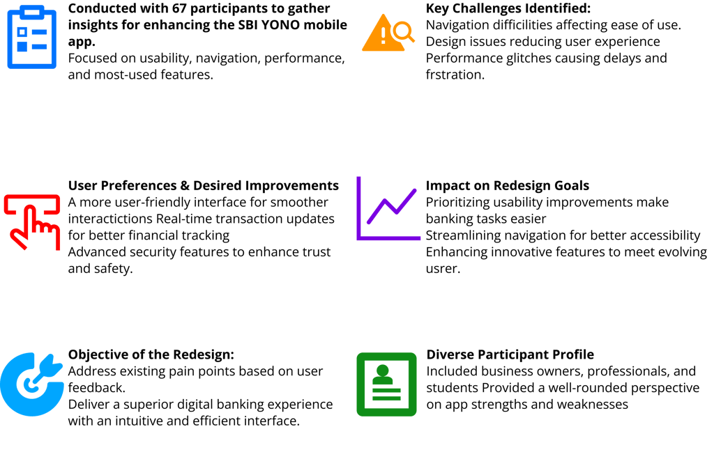
The SBI YONO app faces key usability challenges such as no feedback during OTP failures, hidden essential features, a cluttered home screen, poor visual hierarchy, and inconsistent button behaviors that make navigation confusing and task completion inefficient.
It also suffers from weak accessibility support, scattered help options, inconsistent UI design, a lack of engaging microinteractions, and missing post-transaction actions, leaving the experience fragmented, outdated, and less user-friendly.
6x
83%
4.8/5
More essential banking features accessed compared to standard banking apps during A/B comparison testing
Most test users said they felt more confident managing their finances after using the app
A majority of users reported higher satisfaction and a smoother banking experience after using the redesigned app
SBI YONO (You Only Need One) is the State Bank of India’s flagship mobile app, offering banking, investment, shopping, and lifestyle services in one unified platform. It serves millions of users across India with the goal of making financial services simple and accessible.
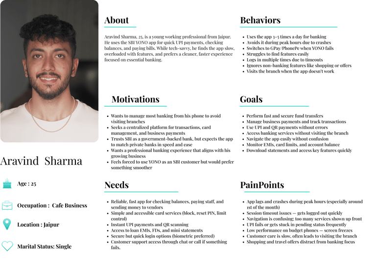
Target Audience
🧍Everyday Users (18–60).
💸 Tasks: Fund transfers, bill payments, checking balances.
📱 Need: Fast, easy-to-use interface for routine tasks.
🧑💼 Small Business Owners (25–55).
📊 Tasks: Payroll, invoices, transactions.
🧾 Need: Multi-account management, tax-friendly tools.
👨💻 Tech-Savvy Millennials (20–40).
📈 Tasks: Budgeting, expense tracking, smart alerts.
🔐 Need: Biometric login, AI insights, dark mode.
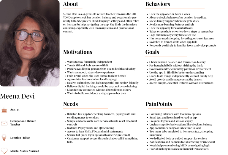
👵 Senior Citizens (60+).
🧓 Tasks: Basic banking, pension tracking.
🔍 Need: Large fonts, voice support, simplified flow.
🚜 Rural Users (25–60)
🌐 Tasks: Money transfers, utility payments.
📶 Need: Lightweight app, offline/low-data support, regional languages.
✈️ Frequent Travelers (25–50)
🌍 Tasks: Currency exchange, ATM locators abroad.
💳 Need: International cards, travel insurance, travel spend analyzer.
🎓 Students & Young Adults (16–25)
🏦 Tasks: Scholarships, student loans, budgeting.
📅 Need: Financial tips, reminders, gamified saving tools.
💼 Investors (25–55)
💹 Tasks: Mutual funds, stocks, fixed deposits
📊 Need: Portfolio dashboard, alerts, in-app consultation
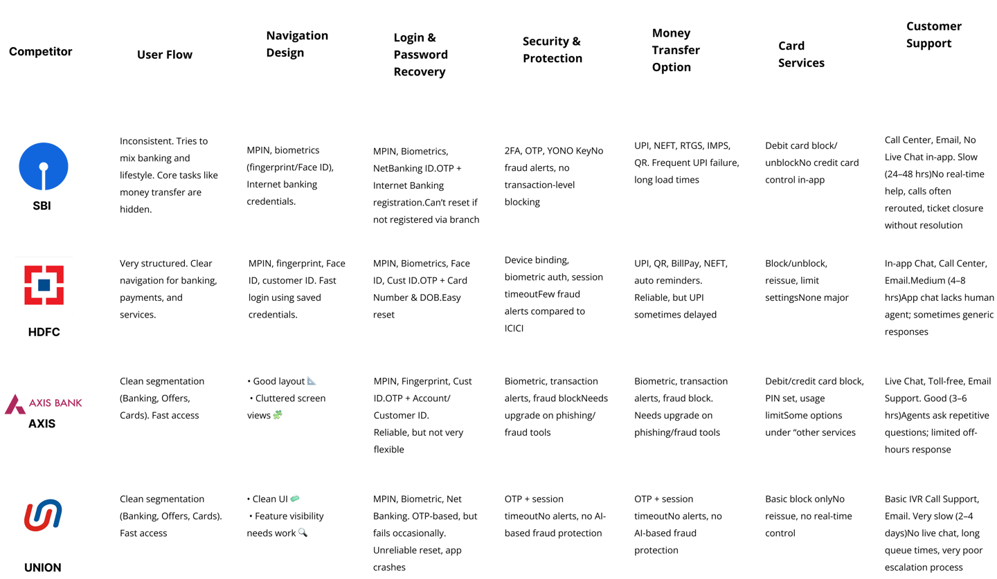
Competitive Analysis

User Research/Survey
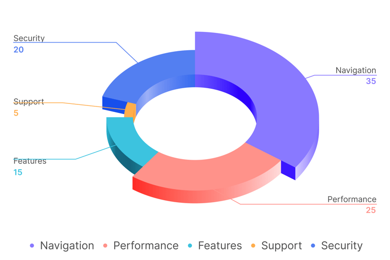
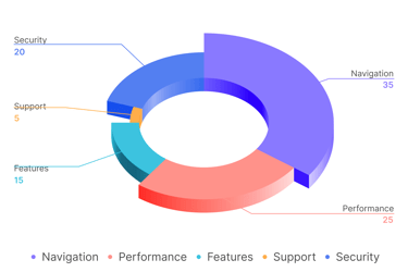


Which Parts of SBI YONO App Should Be Improved?
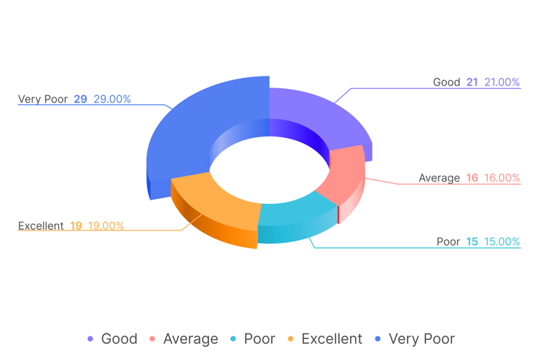
User Experience with SBI YONO App
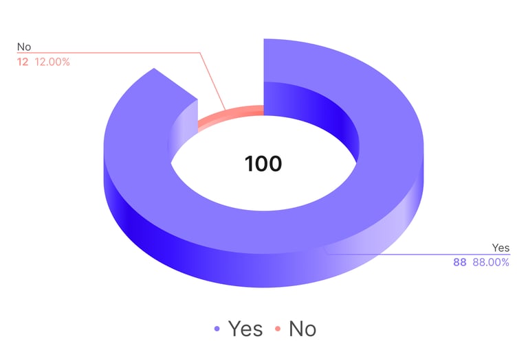
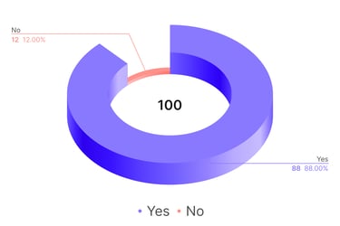
Should the SBI YONO App Be Improved?
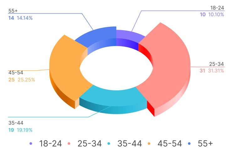
Age Distribution in User Research Survey
User Feedback on improving the SBI YONO
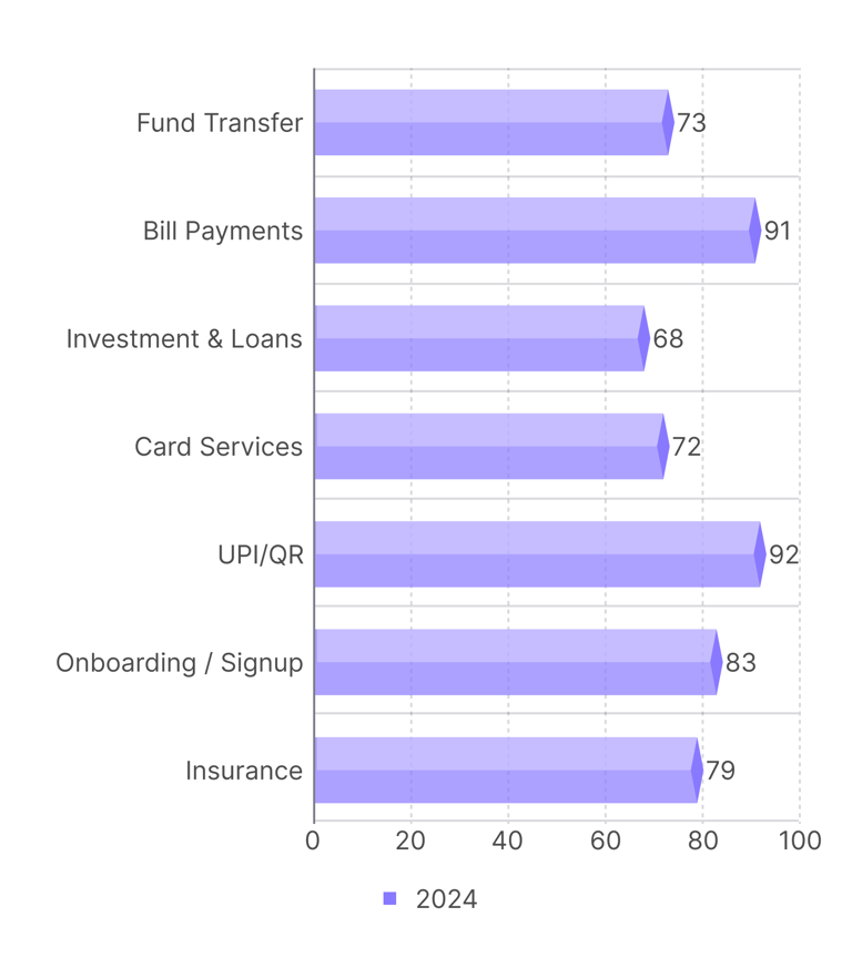
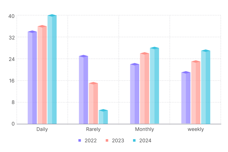
Frequency of Mobile Banking Usage

Secondary Research
Personas


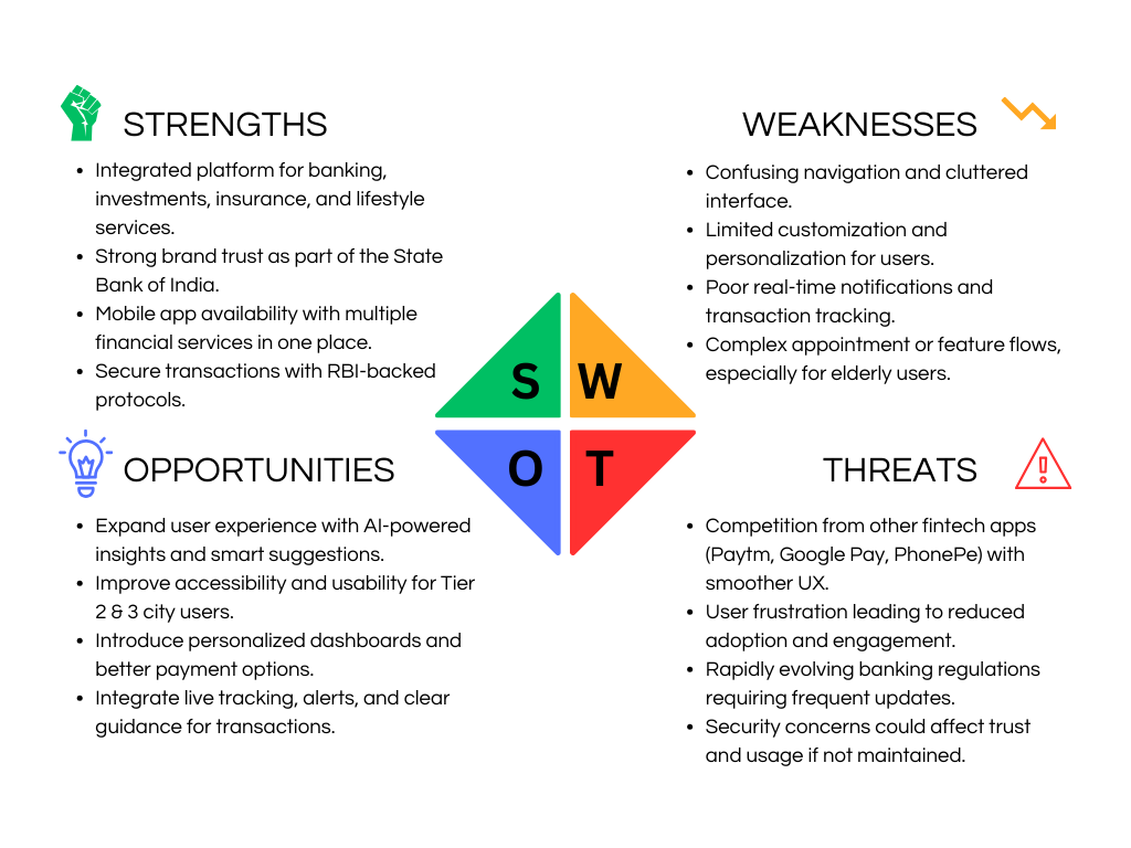
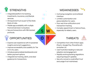
SWOT ANALYSIS
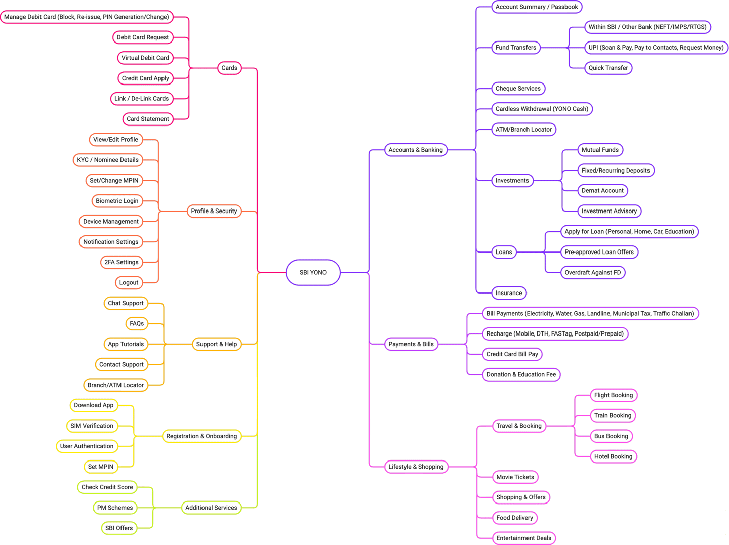
Information Architecture

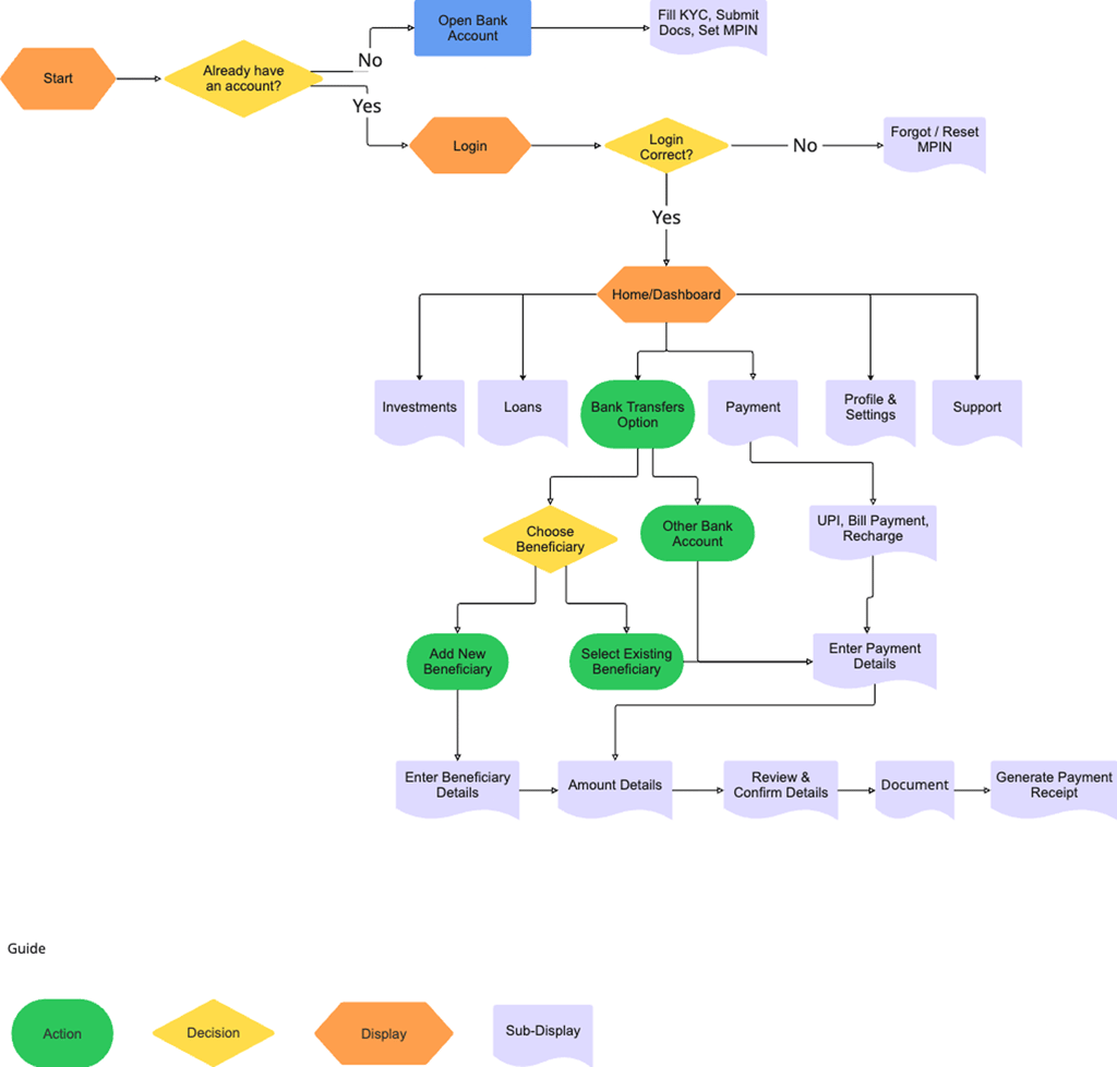
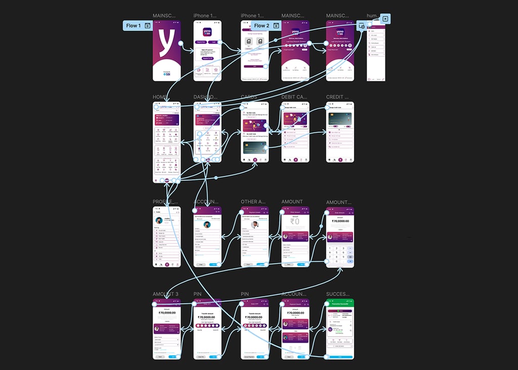
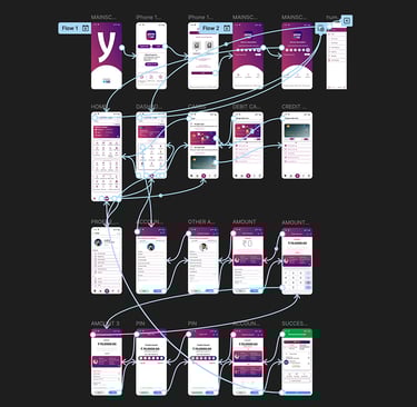
User Flow
Design


Solution and Comparison
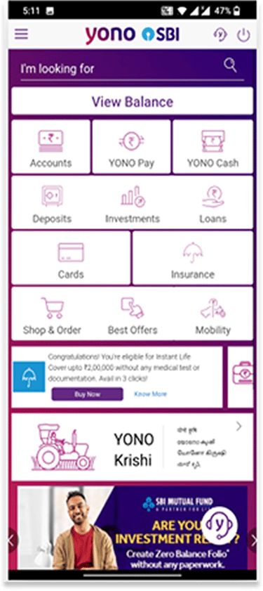
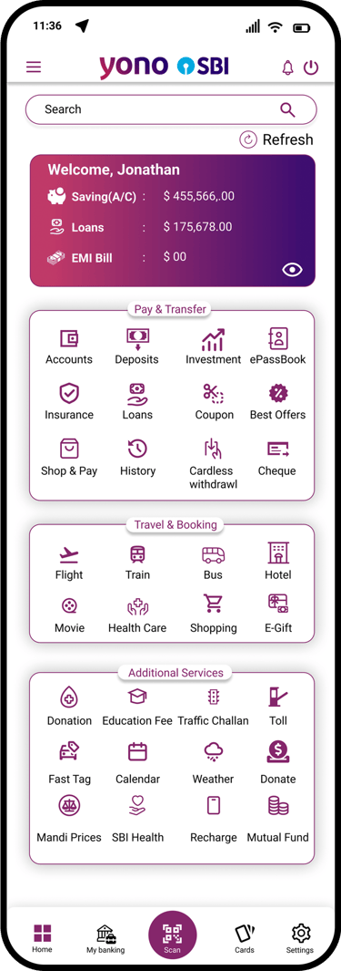
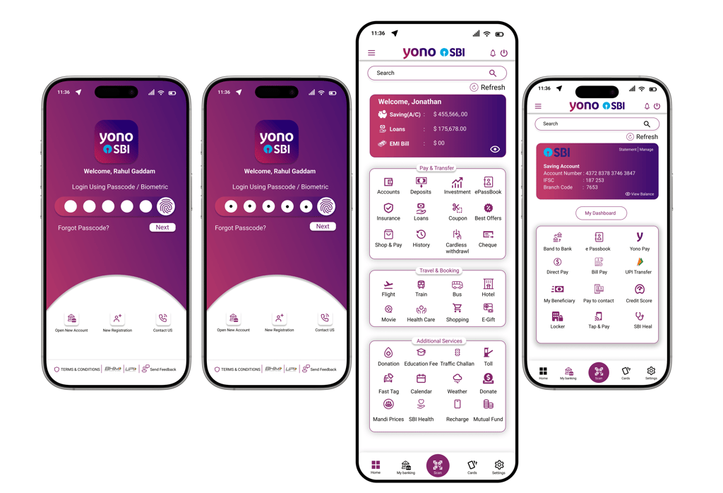
Enhanced Visual Hierarchy: Key account details like balances and loans are placed at the top within a gradient card for better visibility and focus.
Improved Navigation: A clear grid layout organizes essential banking functions, making them easier to locate and use.
Bottom Navigation Bar: Provides quick access to key features like Profile, Cards, Scan, and Home, improving overall app usability.
Personalization: A greeting such as "Welcome Rahul" adds a personal touch, increasing user engagement and trust.
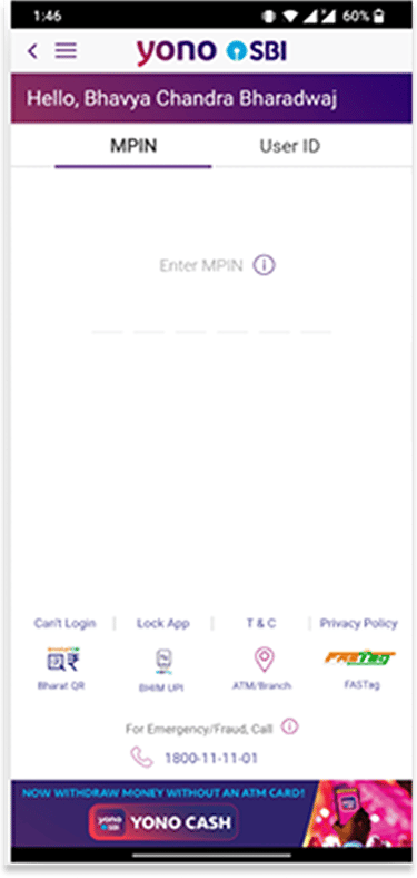
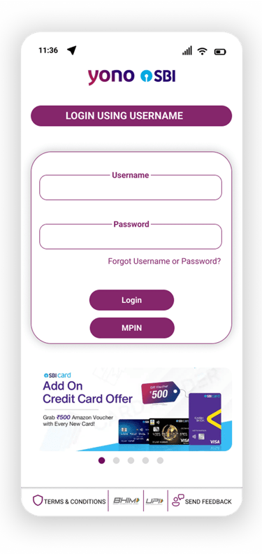
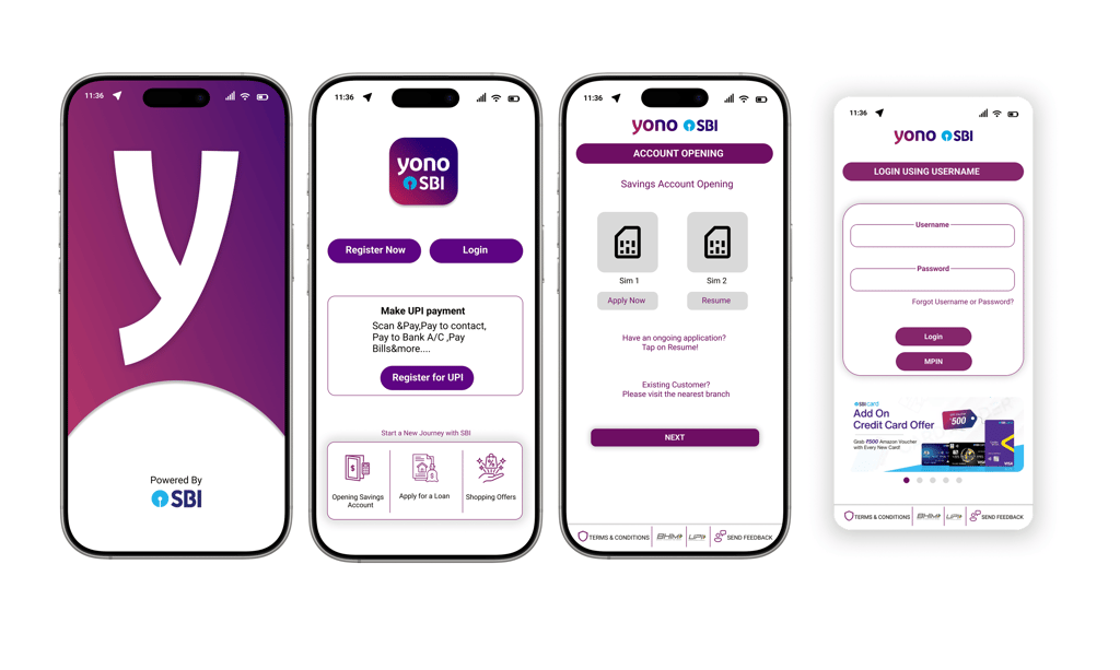
Clear Separation of Login Methods: "Username" and "MPIN" options are placed prominently to reduce confusion and help users select their preferred method easily.
Streamlined Navigation: Links like "T&C," "Privacy Policy," "Send Feedback," and payment logos are moved to the bottom bar, keeping the main login area uncluttered.
Enhanced Branding: A promotional banner for SBI credit card offers is added at the bottom, reinforcing brand identity without disrupting the login process.
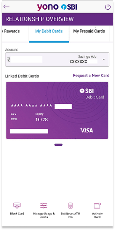
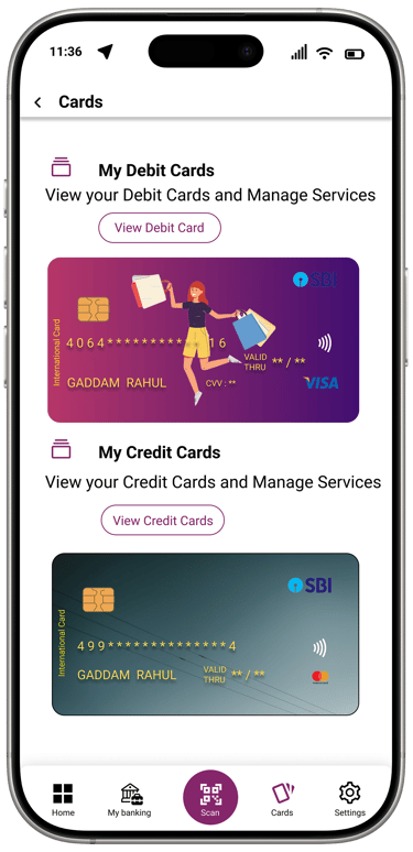
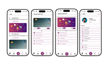
Improved Visual Hierarchy: Gradient card layout with clear labeling makes key details like the cardholder’s name and number easily readable.
Enhanced Functionality: Includes a "View Debit/Credit Card" button and an eye icon to toggle sensitive information, offering better control and security.
Simplified Navigation: A floating action button (FAB) provides quick access to scanning functions.
Easy Card Switching: Circular indicators below the cards allow users to switch between multiple cards smoothly.
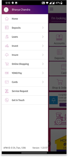
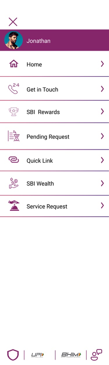
Enhanced Personalization: User’s name and profile photo are prominently displayed at the top of the screen.
Improved Navigation: Touch-friendly icons are added beside menu items like "Home," "Deposits," and "Service Request" for easier identification.
Quick-Access Section: A dedicated area at the bottom of the menu offers fast access to frequently used features like "Deposits," "Loans," and "History," improving efficiency.
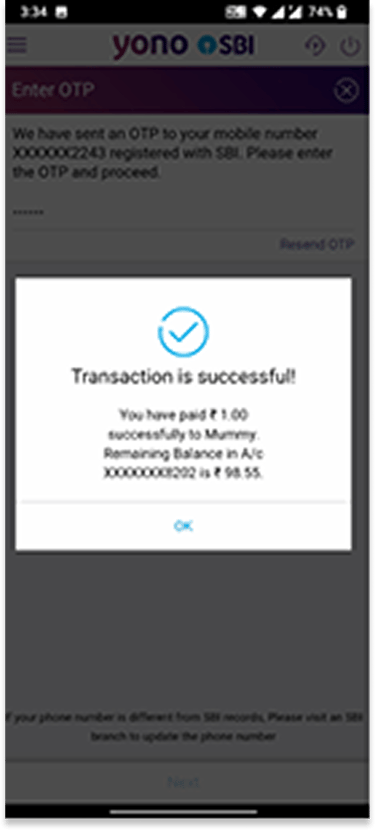
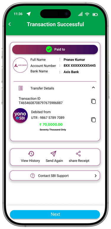
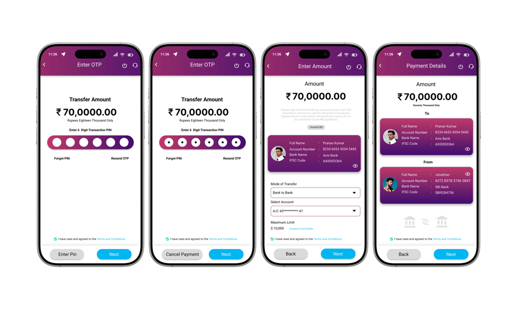
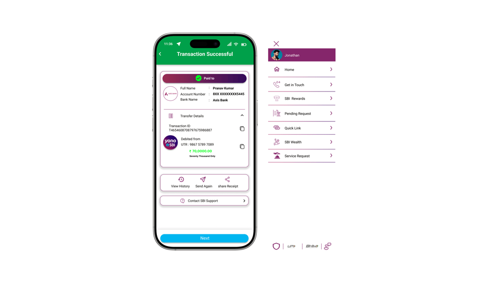
Clearer Feedback: A prominent green "Transaction Successful" header provides immediate confirmation of success.
Structured Layout: Key transfer details such as recipient name, account number, bank, Transaction ID, and UTR are clearly displayed for better clarity.
Actionable Buttons: Options like "View History," "Send Again," and "Share Receipt" enable quick post-transaction actions, improving efficiency and convenience.
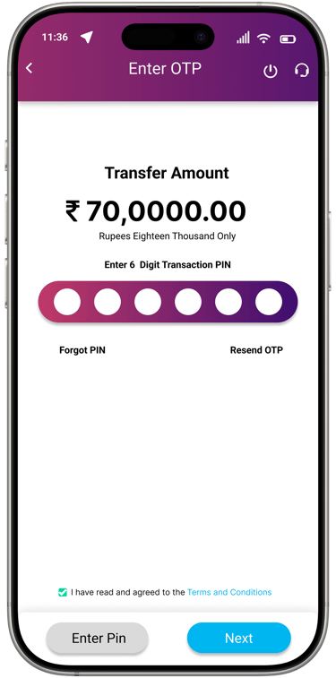
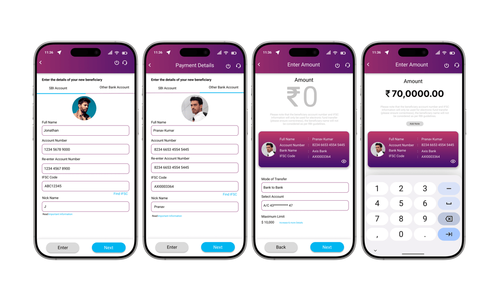
Clear Display of Transfer Amount: The amount is shown in bold text with its written form to reduce confusion.
Improved Input Experience: A modern 6-dot PIN entry system replaces the outdated OTP method for smoother usability.
Enhanced Action Buttons: Clearly styled "Next" and "Cancel" buttons offer better control and navigation.
Accessible Support Options: Easy access to "Forgot PIN" and "Resend OTP" improves user support.
Organized Layout: A grid-based layout with improved spacing ensures a clean, user-friendly design aligned with modern UI standards.
Old
New


OTP Screen
Transaction Screen
Humburger Menu
Cards Screen
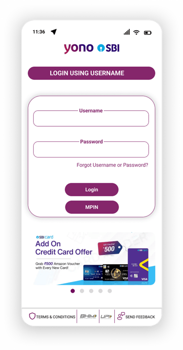
Login Screen
High Fidelity


Prototype
What I Learned
The SBI YONO case study highlighted the importance of user-centric design and seamless functionality in mobile banking. Serving both personal and business users, the app requires clear user flows for tasks like account login, fund transfers, bill payments, and loan management.
Key takeaways include simplifying navigation, ensuring easy access to essentials (beneficiaries, profiles, receipts), and strengthening security with MPIN and biometrics. Addressing issues such as login difficulties, limited options, and a cluttered interface is vital. A modular, intuitive design helps reduce friction while balancing functionality, security, and ease of use, ultimately boosting user satisfaction.